For over 120 years, we have pursued an unrelenting ambition to create the world’s most trusted and sought-after protective wear. Throughout the decades, we have consistently demonstrated our commitment to quality, delivering world-class safety equipment while continuously pushing the boundaries of protection technology. These guidelines ensure that all brand touchpoints remain consistent across our global platforms, products, and promotional activities.
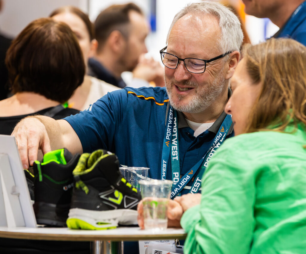
Charles Hughes, son of a small farmer on the wild Atlantic coast, was determined to have the best workwear and footwear when he founded his business in 1904. Over 120 years later his core principles of exceptional design, quality, value and service still apply today. Portwest develop and manufacture protective workwear designed to take on the harshest conditions that this world has to throw at us.
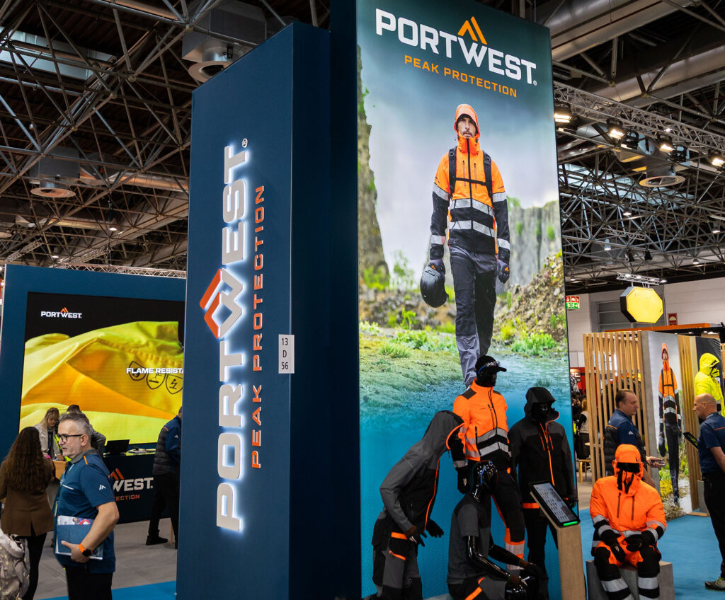
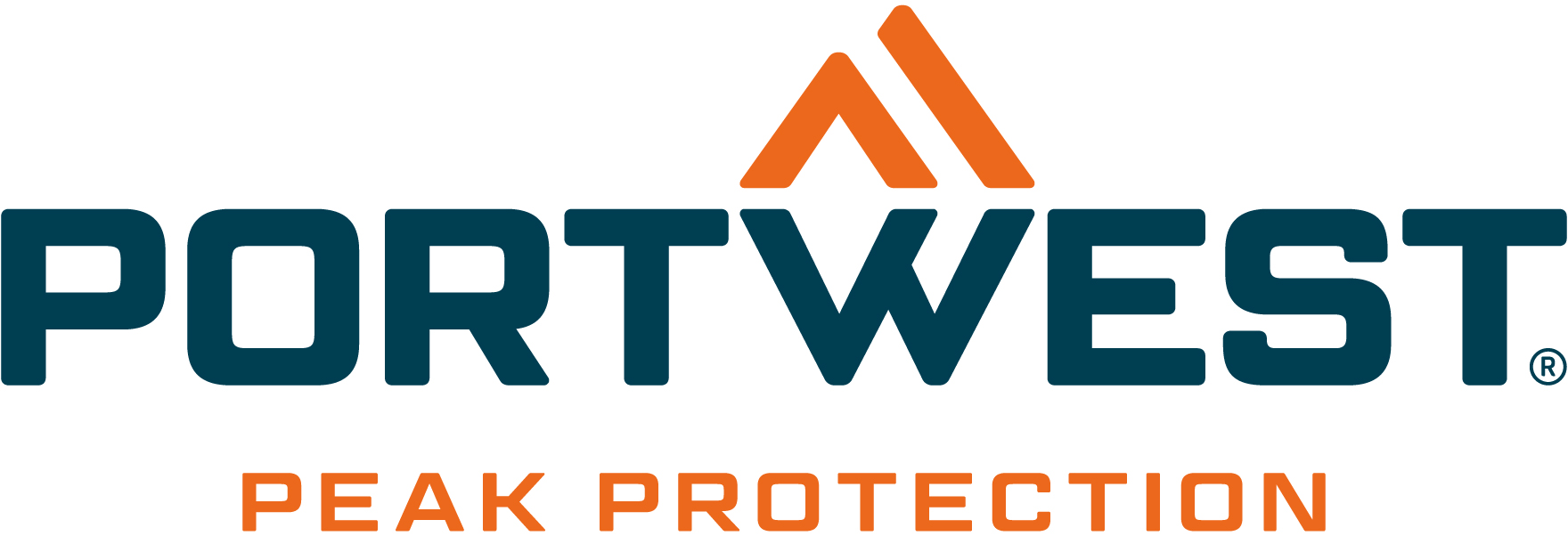
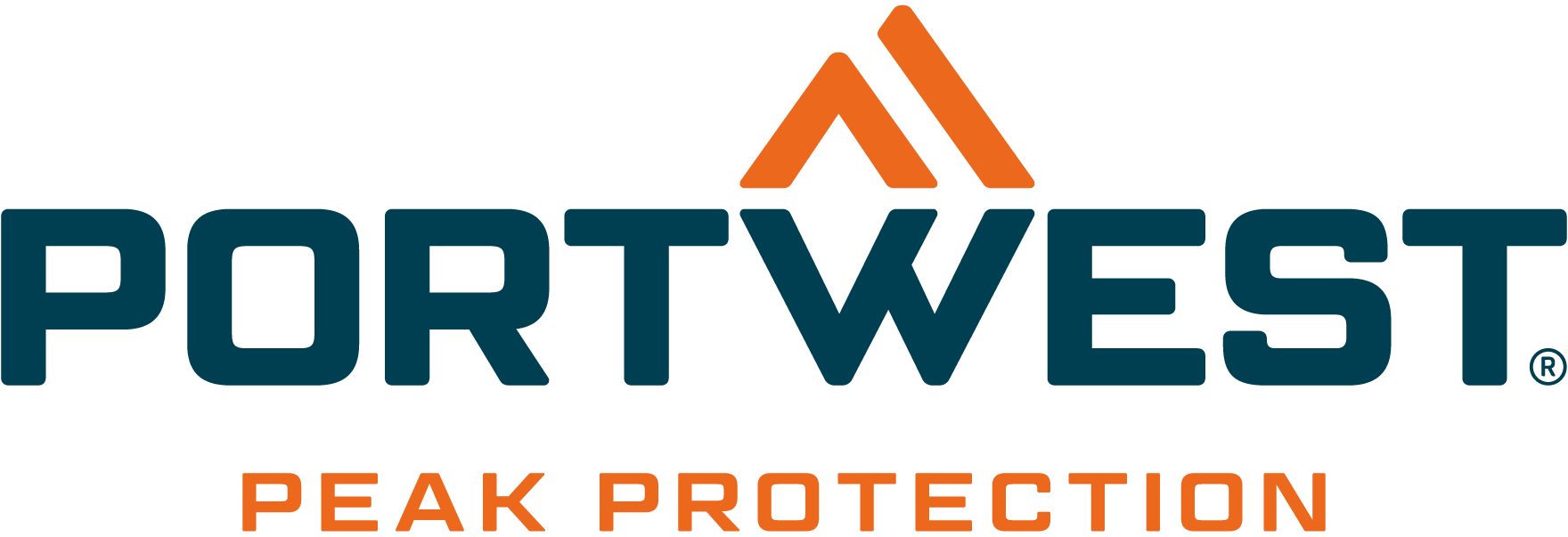
We call it, PEAK PROTECTION
A defined Tone of Voice is a critical element of our brand, allowing customers to recognise our personality and distinguish us within a competitive category. These pillars will help us craft and hone our voice when we speak, staying true to the brand’s DNA and respecting the values that are important to us.
Think of Portwest and our customers as a team. They rely on us to protect them, and we rely on them to keep our business evolving. Show we understand them and the challenges they face.
We are always innovating, developing and improving. As we say in our values – Make Something Better Today. Show our commitment to getting better and always working for our customers.
Use our proven heritage of innovation and our respected reputation to show influence, initiative and inspiration in our position as a market leader.
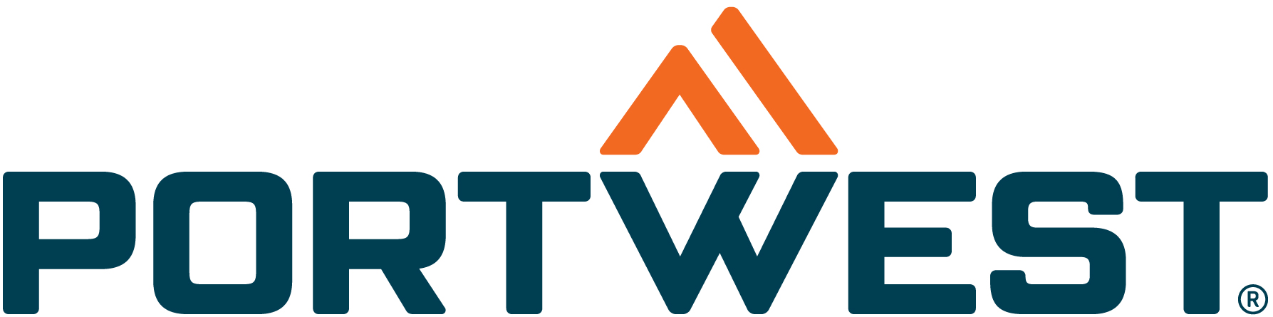
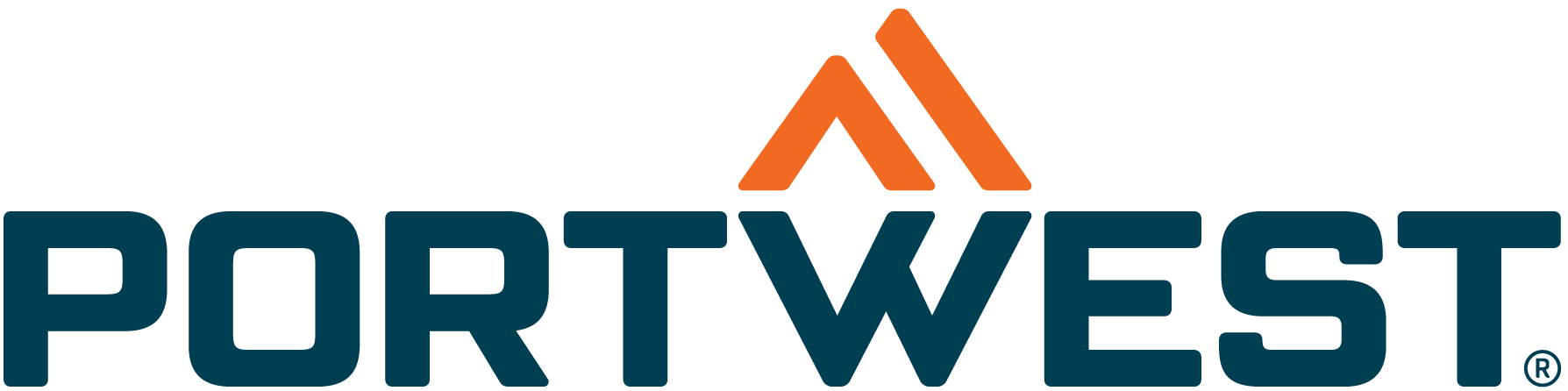
Our brand is a confident, modern evolution of the original Portwest mountain logo. Rooted in our heritage in the west of Ireland, the iconic mountain Croagh Patrick symbolises strength and resilience against the elements and is reflected in our Mountain icon. As people, we require protection from the forces of nature – particularly when working in hazardous conditions – and this need is echoed throughout our brand philosophy of PEAK PROTECTION.
CORPORATE LOGO
Used as the lead logo on all corporate promotional materials that do not include a subrand.
Example: Corporate catalogue covers, billboards, presentation introductions, product stands and trade show displays. The tagline logo should not be repeated within a document. Subsequent use of logos (inner pages/subsequent slides etc) use Master logo without tagline.
! When a sub brand is being promoted the Master logo without tagline should be used.
MASTER LOGO
The Master Logo does not include the tagline and is the company’s core, flexible brand mark. It is designed for everyday use and for situations where the brand needs to coexist with sub-brands, product brands, or partners.
For maximum clarity and impact the Portwest logo must not be reproduced smaller than 50 mm × 12.5 mm in print. This ensures legibility and consistent brand presence across all printed materials.
Always allow for maximum clear space around the Portwest branding where possible. When space is compromised, please allow for one full height space of the portwest ‘P’ around the logo and symbol.
When the Portwest logo is used on backgrounds other than white a contrast between the orange logo icon and the background colour is needed. If this is not possible either a full white or black logo is the preferred option.
Always use the full colour reversed Portwest logo on the brand swatch PORT BLUE as the preferred option.
On dark coloured backgrounds where there is sufficient contrast between the orange mountain icon and the background colour use the full colour reverse logo.
On light coloured backgrounds always the full colour logo options. Preferred <10% tint.
NOTE: Placing the Portwest logo on orange/red hue backgrounds is to be avoided however when necessary the logo in full white is the preferred option.
NOTE: Similarly placing the Portwest logo on yellow hue backgrounds should be avoided but when necessary a full black logo is the preferred option.
These colours form the core of our brand identity and should be used consistently when representing the brand. Our primary brand colour is PORT BLUE, which should be the first choice for backgrounds across most promotional materials. Wherever possible, our logo should appear on a PORT BLUE background to ensure maximum impact and brand recognition.


PORT BLUE is at the heart of the Portwest brand identity. Consistently highlighting this colour strengthens brand recognition, reinforces our reputation for quality and reliability, and positions Portwest as a trusted leader in protective workwear.
For the most part ALERT ORANGE and CHARCOAL are accent colours.
Our experienced in-house design and marketing team offers expertise across all areas of creative design and can supply a more comprehensive Brand Toolkit to support your design requirements.